Dear CDS-Team,
the solution to my question regarding the addition of a trend line to my plot was very helpful (see "Plotting a trend line").
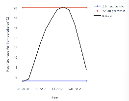
Continuing on a similar case the next step would be a line (or two) which represent the percentiles (e.g. 2.5% and 97.5%). There is indeed a function to calculate the values (ct.cube.quantile) but plotting a line is again tricky.
First idea was to use the function provided in the cds-forum thread "Plotting a trend line" and adjust the start- and end-values somehow to get a horizontal line. As I took notice of the possibility to import python libraries (like matplotlib and xarray), it seems still tough to replace xarray values with the required percentiles. Is this nevertheless a productive way or are there other possibilities to plot a horizontal line with percentiles?
Please see a shortened version of my code attached.
Any help is appreciated!
Thanks and regards
Tim Usedly
import cdstoolbox as ctlayout = ct.Layout(rows=1)
layout.add_widget(row=0, content=‘output-0’)@ct.application(layout=layout)
@ct.output.livefigure()def application():
NOAA = ct.catalogue.retrieve(
‘reanalysis-era5-land’,
{
‘variable’: ‘2m_temperature’,
‘year’: [‘2010’],
‘month’: [
‘01’, ‘02’, ‘03’,
‘04’, ‘05’, ‘06’,
‘07’, ‘08’, ‘09’,
‘10’, ‘11’, ‘12’,
],
‘day’: ‘01’,
‘time’: ‘00:00’,
}
)NOAA_cut = ct.cube.box_select(NOAA, lat=[-60,60]) NOAA_avg = ct.cube.average(NOAA_cut, dim=['lon','lat']) coords = ct.cdm.get_coordinates(NOAA_avg) start_date = coords['time']['data'][0] end_date = coords['time']['data'][-1] fig = ct.chart.line( NOAA_avg, layout_kwargs = { 'xaxis':{ 'showline':True, 'showgrid': True, }, 'yaxis': { 'showline':True, 'showgrid': True, 'tickmode' : 'auto' }, }, scatter_kwargs = { 'mode': 'lines', 'line.color':'black' } ) # Percentil quantile25 = ct.cube.quantile(NOAA_avg, q=0.025) quantile975 = ct.cube.quantile(NOAA_avg, q=0.975) print(quantile25) print(quantile975) # Calculate linear fit fit = ct.stats.extrapolate( NOAA_avg, date_range_kwargs= { 'start': start_date, 'end': end_date, 'periods': 2 }, func='linear' ) # Plot the calculated fit fig = ct.chart.line( fit, fig=fig, name='linear trend line', scatter_kwargs = { 'marker':{ 'color':'orange', } } ) return fig</pre>