I download pollens forecast :
‘cams-europe-air-quality-forecasts’,
{
‘variable’: [
“alder_pollen”,
“grass_pollen”,
“mugwort_pollen”,
“olive_pollen”,
“ragweed_pollen”
],
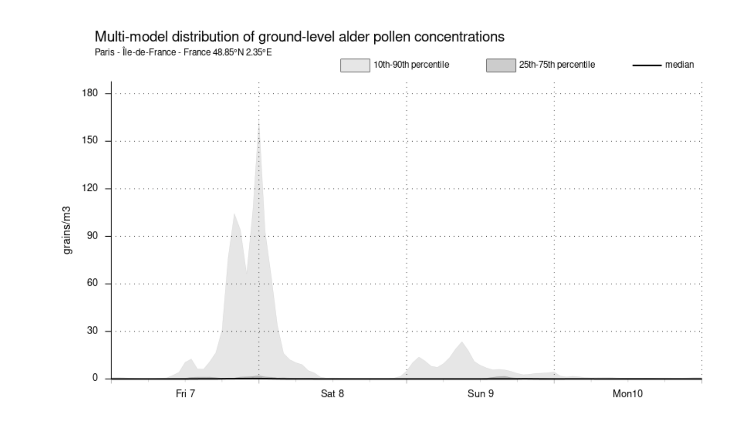
there are actually alerts about Alder pollen in the air. Confirmed by your charts online.
In this chart the max value is about 190 grains/m3.
When I download the forecast for the same Day, I have a value max for ‘apg_conc’ in the NC dataset of 0.019102096557617188.
It seems that there is a 1000-fold discrepancy between the online chart and the data retrieved by the API query. The online documentation indicates that the unit is indeed grains m-3, but the values retrieved are much lower and contradictory to the online chart display.
Hello Ronald,
If I’ve well understood, the big discrepancy you observe is because the time plot and the netcdf file show different information.
The time serie is a multi-model distribution of the 11 air quality models composing the CAMS European Ensemble. In the graph you showed, the shaded area actually represents the spread of the eleven models forecast and the median (black curve) is almost close to zero and not visible: I guess you probably downloaded the Ensemble median netcdf file and the low values you’ve found are in line with the median in the time plot.
The spread among models can be large, as pollen concentrations in the air can increase or decrease by orders of magnitude in a short period. The strong dependence on multiple factors, including meteorological conditions, makes it challenging to capture pollen episodes, in particular at the beginning of the pollen season.
Best regards,
Massimo
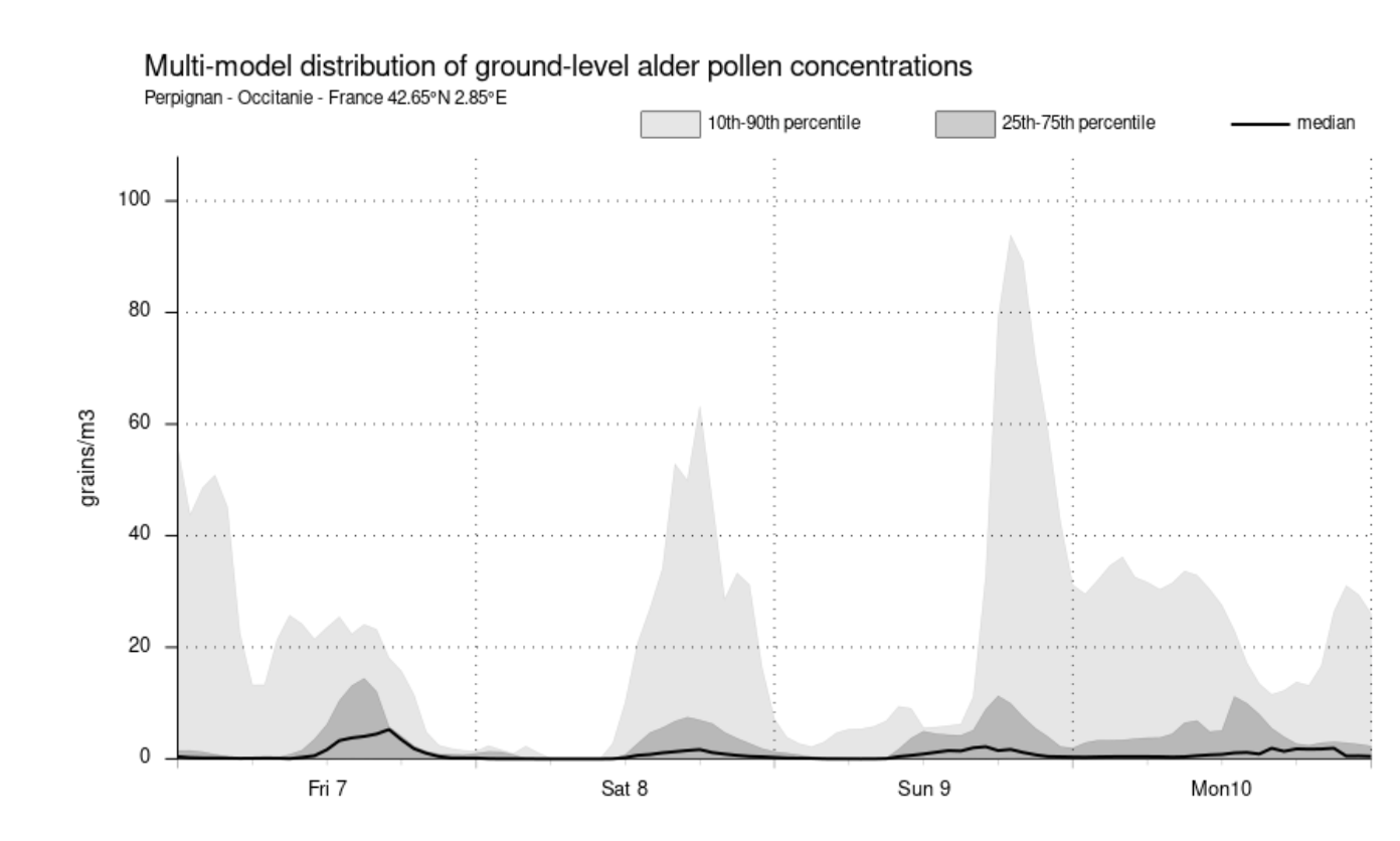
Ok , I understand. And I did a test , I searched in my NetCDF data, the max values for France. And found 5.3 grain/m3 for Perpignan city in the south of the country. And the value for this city on the time plot are this time very coherent with the NetCDF values.